Title Design
I think that this will be the primary font and color used as I think it contrasts the dark background I’m going with. Gold is also a clean color as well. I’m quite bad a cropping things into place so just imagine this font on the dark background without the white. My titles will mostly be in a semi dark, area of the screen where the lighting does not hit.
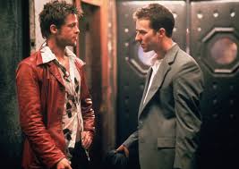
Back to the titles, my titles will move in and out mostly through a simple cut, like I will transition them when I’m moving to a new camera angle. I took this inspiration from one of the films I researched, Se7en. The titles will be about 12 seconds long each, and that might sound long but I have a small team and will only have about 10-15 titles. I’ll try to add more to reduce the time for each, though, so it is also subject to change. Anyways, that is it bloggers.


Comments
Post a Comment